

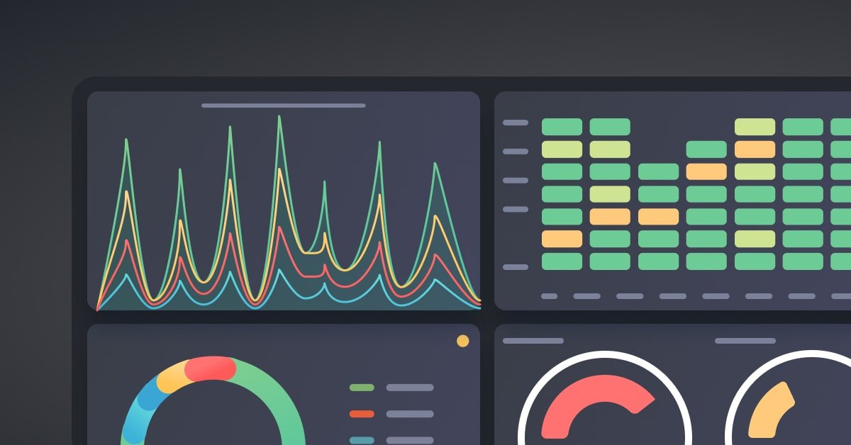
Grafana dashboards are really important for apps. These applications produce a lot of metrics, logs and traces every second. It is crucial to collect this data.. It is only useful if engineers can understand it quickly and act on it with confidence. That’s where Grafana comes into play. Grafana is a platform that allows DevOps teams to visualize the state of their infrastructure and applications. They can see how their cloud resources are being used and how their business is doing.
If you are learning DevOps then learning how to build Grafana dashboards is a must. Companies want DevOps engineers to do more than just show metrics. They need to build dashboards that help with troubleshooting, make systems more reliable and support decision making. DevOps course have also included hands – on practice across various projects & case studies . A good dashboard design decreases fatigue, streamlines incident response and helps engineering teams have a common understanding of the systems health.
Build Dashboards Around Business and Operational Objectives
The mistake that teams make is building dashboards that show all the metrics. More data doesn’t always translate into decisions. Good Grafana dashboards begin with a purpose. Determine who will use the dashboard and what decisions they will need to make before deciding what to show. A Site Reliability Engineer might look at things like infrastructure utilization, latency and error rate. An engineering manager might want to see frequency, service availability and incident trends. Every visualization is useful when you customize a dashboard for a user. Grouping metrics also makes dashboards easier to use. Infrastructure metrics such as CPU, memory, storage and network traffic should be displayed together. Another section should include application-level metrics such as request latency, throughput and error rates.
One of the practices is to organize dashboards logically so that engineers can see the relationship of metrics without having to jump between different screens when an incident happens.Also dashboard consistency is important. Dashboards are easier to understand across teams when they use colors naming conventions, units of measurement and panel layouts. Eliminate confusion by showing response time in milliseconds on every dashboard. Make service comparison easier. This consistency in dashboard design is very helpful in companies dealing with microservices across environments.
Grafana variables are a powerful feature that make dashboards more flexible and reusable. By using variables, teams can easily switch between development, staging, and production environments without creating separate dashboards. This simplifies monitoring, improves operational efficiency, and is a practical skill commonly covered in DevOps Training, where learners gain hands-on experience with Grafana and modern observability tools.
Focus on Measures of Visual Complexity
Pretty dashboards don’t always mean more efficiency. The helpful dashboards show the metrics that need action. The RED methodology, which stands for Request Rate, Error Rate and Duration is a way for teams to track the performance of a service. The USE methodology (Utilization, Saturation and Errors) provides an insight into the health of infrastructure. These frameworks help engineers to focus on metrics of overwhelming users with unnecessary visualizations.
Thresholds should be set carefully. Dashboards should clearly indicate warning and critical states using appropriate thresholds. Of showing static graphs engineers should be able to find behavior without having to interpret each graph by hand. By combining Grafana with Prometheus alerting or other monitoring systems dashboards can work with automated notifications creating a monitoring strategy.Dashboard performance should not be ignored. Slow dashboard loading times can be a result of queries, too many panels or too high refresh rates. In incident dashboards keeping it responsive is about limiting time ranges and not having panels that optimize queries.
Annotations give context. Showing events, infrastructure changes, feature releases or maintenance windows on graphs helps teams correlate system behavior with activities. Engineers can instantly tell if a recent deployment caused the performance problem of having to guess why latency went up.Many professionals learning DevOps practice these techniques in hands-on labs integrating Grafana with Prometheus, Kubernetes, Docker and cloud platforms to create production-observability solutions. Hands-on experience helps learners learn about how dashboards are created and how they can be used to support incident management in real-world DevOps environments.
Continue To Improve Dashboards As Systems Evolve
Grafana dashboards should be organic not static and grow with the application. As companies adopt microservices, container orchestration, AI-powered applications and multi-cloud architectures new metrics are becoming important. Regular dashboard reviews help you remove panels, introduce KPIs and ensure that visualizations continue to support goals.
Engineering teams can collaborate effectively with role-based dashboards. At a level executives might need service availability and deployment metrics. Release velocity and incident trends can be monitored by engineering managers. Infrastructure telemetry for troubleshooting is a must-have for DevOps engineers. Dashboards tailored to each role improve efficiency and keep users from getting bogged down with details.Documentation also plays a role in dashboard management. Each dashboard must contain: a description of its purpose; data sources; panel definitions; and ownership.
